hello@ghoneywelldesign.com

CASE STUDY

Smart Desktop Designer

The idea behind the Finsemble Smart Desktop Designer (SDD) was to provide users with a simple starting point to configure their new desktop, ensuring they have all the necessary apps readily available to perform their tasks efficiently. It originated from a comprehensive 40-page technical architecture document authored by our Principal Engineer. I parsed through the document, discerning the visualization requirements for each component within a product settings dialog. Recognized as the cornerstone and future trajectory of Finsemble, the SDD played a pivotal role in enhancing software accessibility for individuals lacking a technical background. 

Client

Finsemble

Date

2021

Category

UI/UX

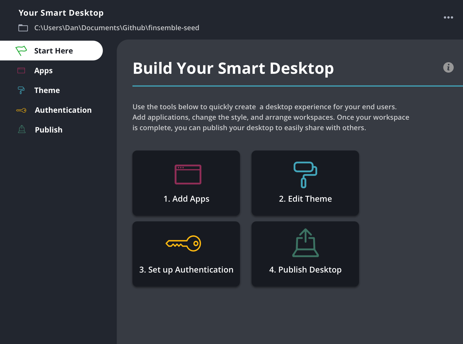
Task: Translate complex developer configs into a simple settings dashboard. Finsemble was originally built to be implemented by very technical, advanced devlopers. As the product and company evolved, we realized that making the product set up faster and easier would streamline both our POCs and handoffs to clients.

Version 1 mockups

Challenge: The initial focus of the SDD was to prioritize simplicity, ensuring a swift rollout. As developers embraced the simplified setup, demand grew for additional advanced configuration settings. While version 1 served the initial requirements, it became evident that every aspect of the dashboard would require capacity for an expanded array of settings and options. Thus, I began version 2.0 with simplifying the navigation to allow for flexibility and expansion.

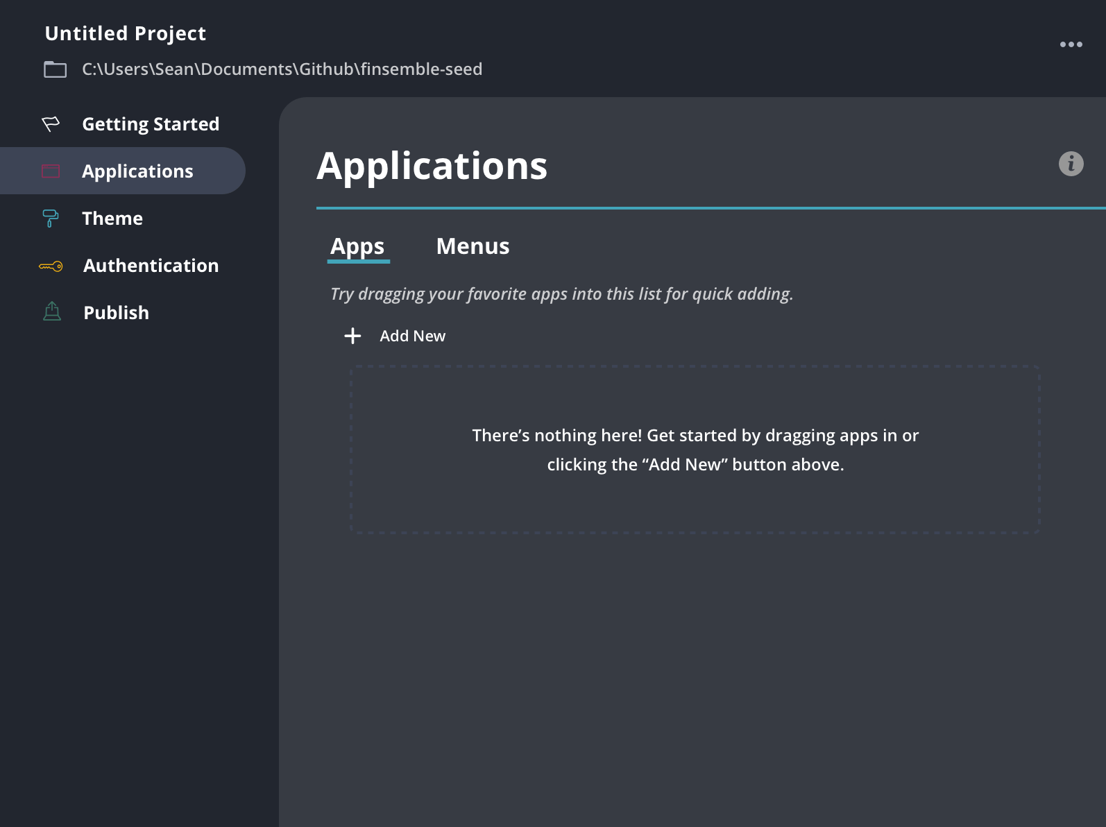
SDD navigation

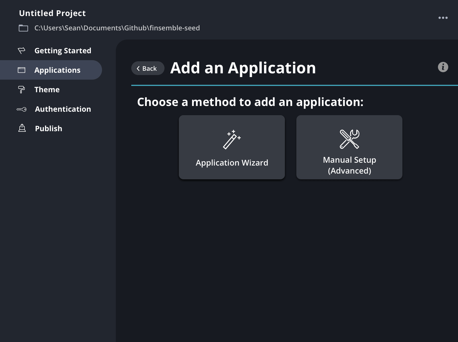
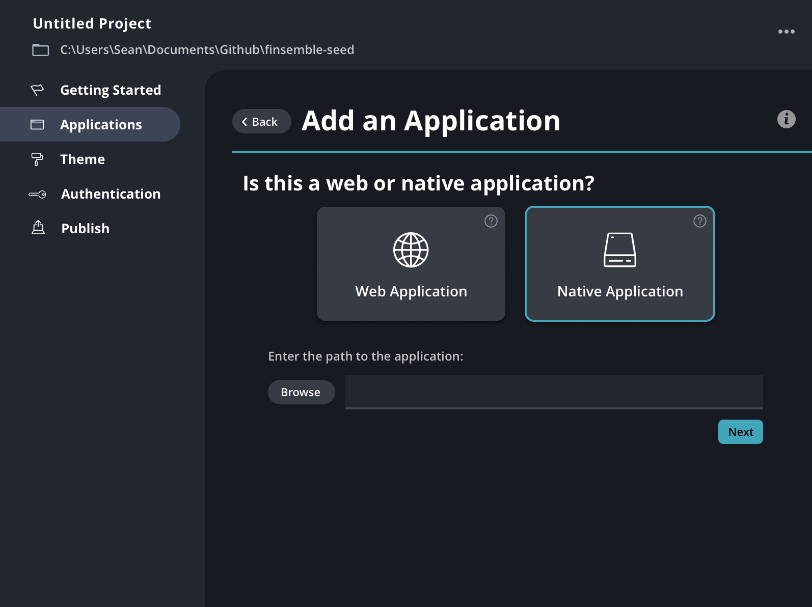
Solution: By streamlining the navigation, I organized menu options into intuitive categories, facilitating user identification of the desktop components they were configuring. To illustrate the complexity of the configs, see below for an example of how many are available for each individual app. All of the optional settings can be collapsed or expanded, depending on the level of specificity needed.

Smart Desktop Designer Add an App

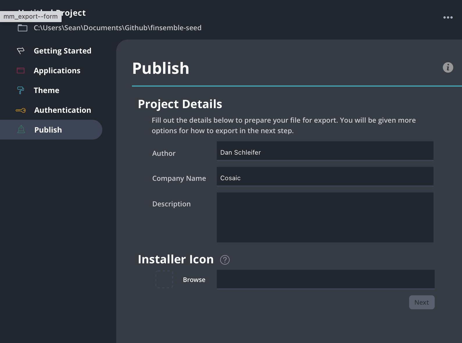
Futher refinement: In this design update, I tackled the issues of product hierarchy, readability, and overall overwhelm by reorganizing the navigation and enhancing the visual flow to emphasize the product’s organization. More specifically, I achieved this by:

  • Indenting the navigation items to visually depict the relationships between them, providing a clearer understanding of their hierarchy.
  • Tailoring the visuals within the cards to reflect the actual project, enhancing user orientation and engagement.
  • Introducing a secondary navigation within the app settings section, enabling users to easily locate relevant information and features.
Privacy Settings
We use cookies to enhance your experience while using our website. If you are using our Services via a browser you can restrict, block or remove cookies through your web browser settings. We also use content and scripts from third parties that may use tracking technologies. You can selectively provide your consent below to allow such third party embeds. For complete information about the cookies we use, data we collect and how we process them, please check our Privacy Policy
Youtube
Consent to display content from - Youtube
Vimeo
Consent to display content from - Vimeo
Google Maps
Consent to display content from - Google

303-898-5587

hello@ghoneywelldesign.com