hello@ghoneywelldesign.com

Case Study

Finsemble Light Theme

My initial foray into UI design involved crafting a light theme for our company’s FinTech product, Finsemble. As Finsemble facilitates interoperability among diverse apps, ensuring seamless UI, data sharing, and functionality is paramount. Beginning with the dark theme as a foundation, I meticulously refined the color palette to harmonize core colors while preserving optimal contrast levels.


Client

Finsemble

Date

2022

Category

UI/UX

Task: Create a new light theme for clients to select as a setting.

The highlighted components are Finsemble. The window contents are separate apps controlled by the individual app developers.

Finsemble with pieces highlighted

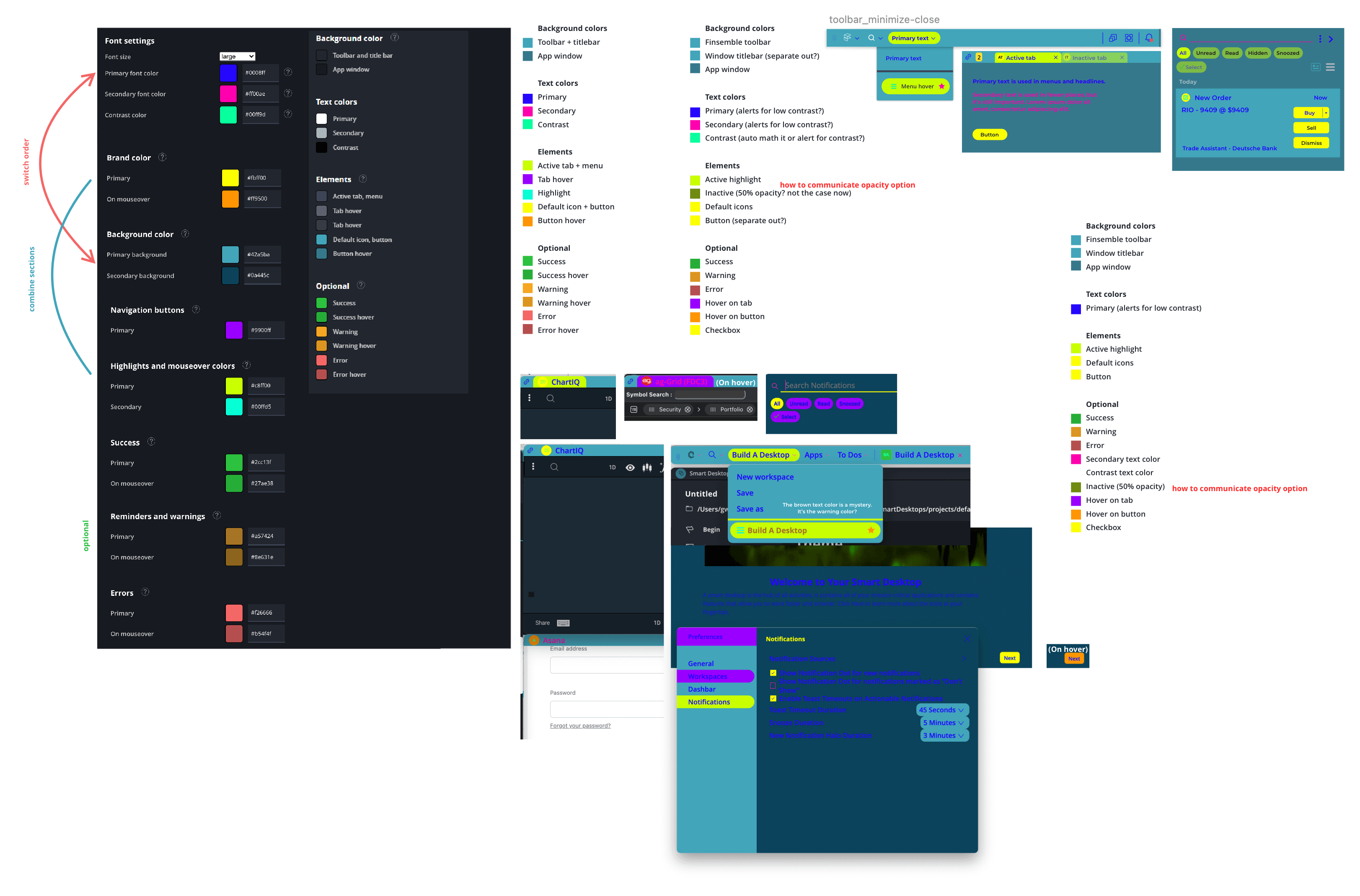
Challenge: Encountering issues such as random colors outside the designated color variables and unintuitive color pairings, I conducted a comprehensive assessment. Stepping back, I meticulously mapped out the alignment of each named variable with its corresponding location within the product, ensuring coherence and consistency throughout the UI design.

Finsemble Theme Mapping

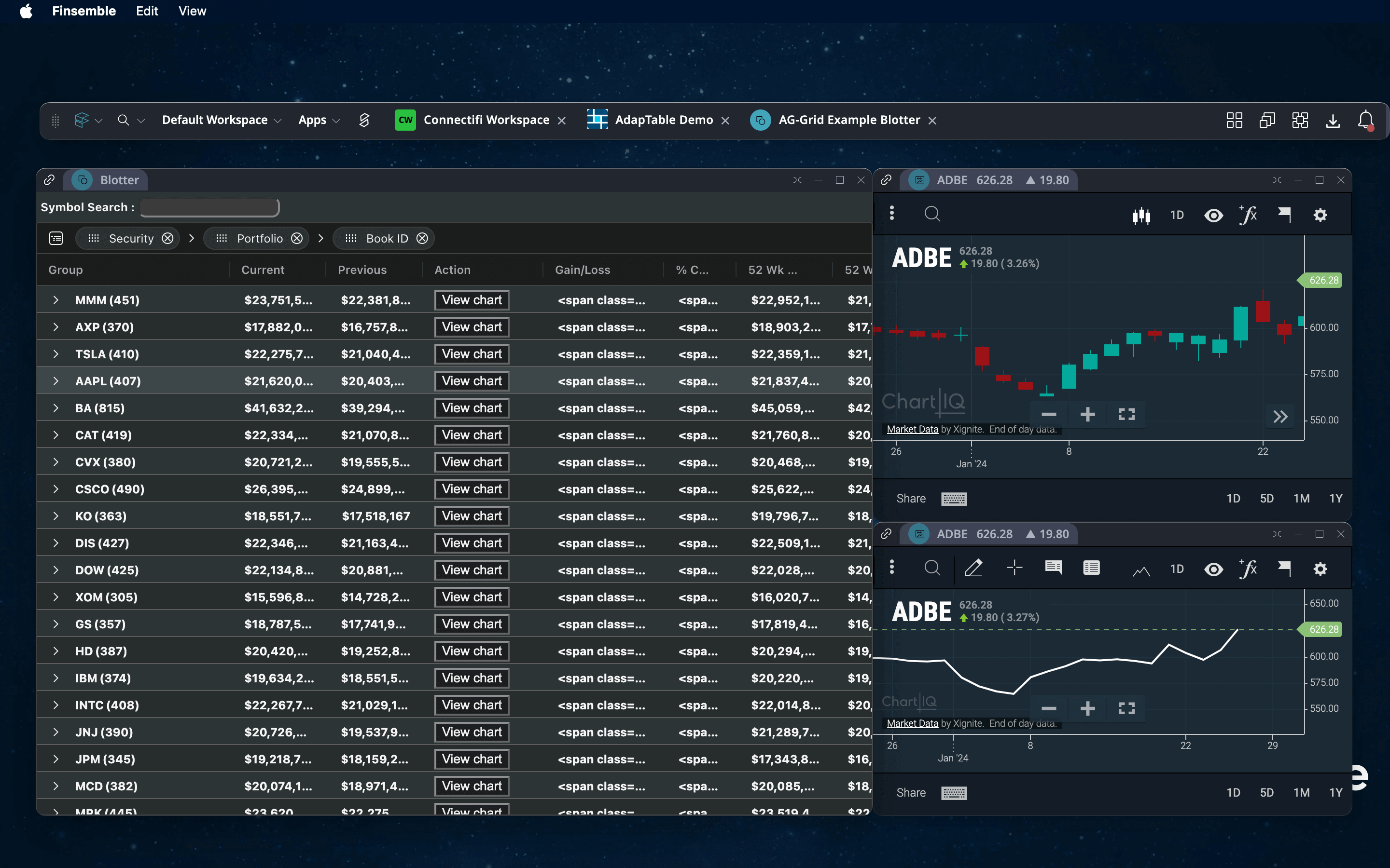
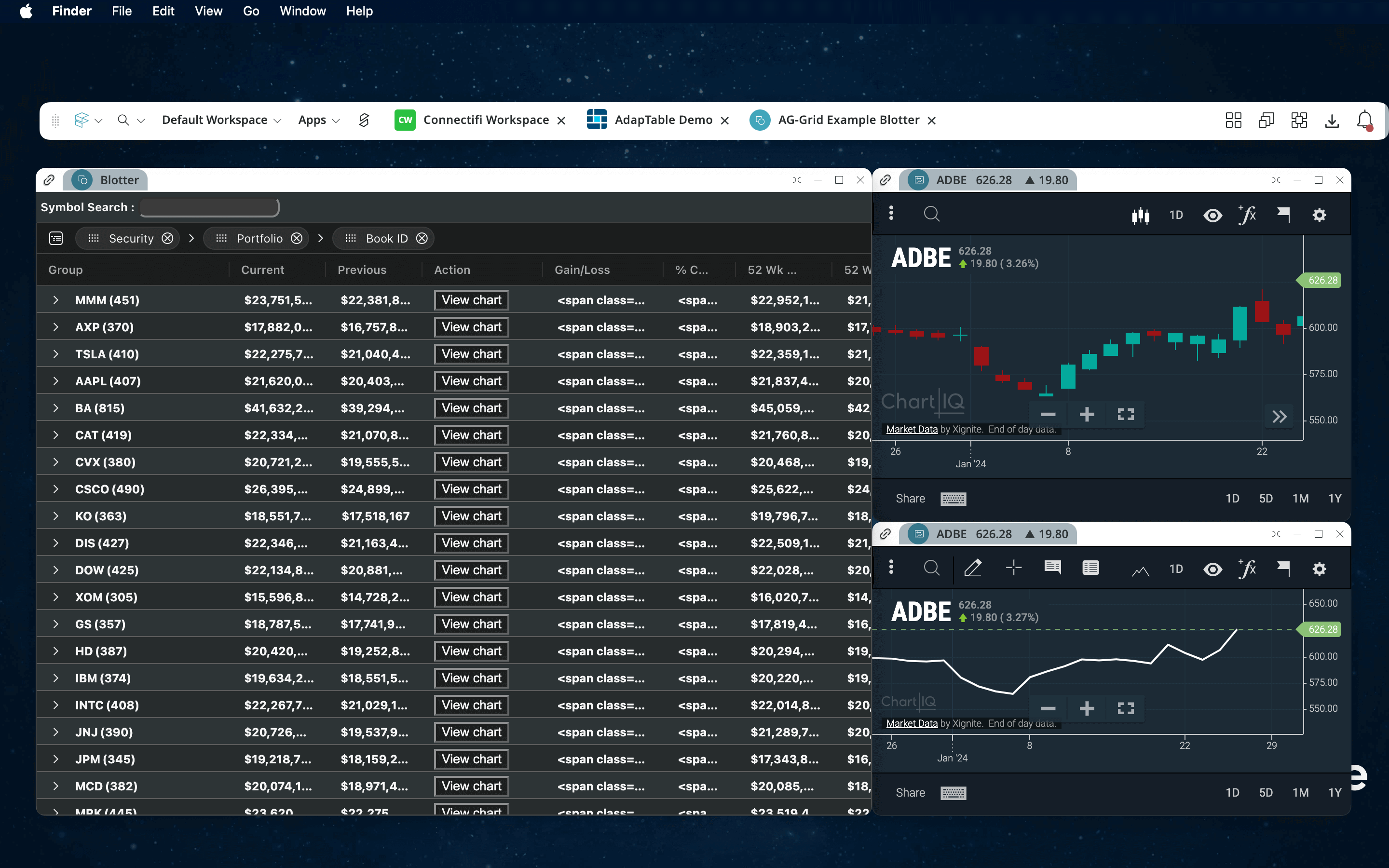
Solution: The color mapping allowed me to identify duplicate colors and places where we needed to add or remove color differences. You can see the two themes below.

Finsemble Dark Theme

Night theme

Day theme

Privacy Settings
We use cookies to enhance your experience while using our website. If you are using our Services via a browser you can restrict, block or remove cookies through your web browser settings. We also use content and scripts from third parties that may use tracking technologies. You can selectively provide your consent below to allow such third party embeds. For complete information about the cookies we use, data we collect and how we process them, please check our Privacy Policy
Youtube
Consent to display content from - Youtube
Vimeo
Consent to display content from - Vimeo
Google Maps
Consent to display content from - Google

303-898-5587

hello@ghoneywelldesign.com